Thoughts on map projections and the racism of the Mercator projection
I think about map projections sometimes.
I'm not a geographer, and I'm not a mapmaker. I just have a passing interest in map projections.
So I'm gonna share some thoughts on them.
The problem
Geographers will likely want to kill me for simplifying too much here. So be it. I'm going to give the very simplified, lots of detail and specific definitions left out version of the problem.
When trying to turn the 3D sphereoblate spheroid that is mother Earth into a flat map, there will always be distortion. This cannot be avoided. There's actually a remarkable theorem about this, but I won't get into it.
The various methods of distorting the map to make it fit on a 2D surface are called projections.
One might think an approach like Google Earth showing the Earth as a sphere can solve it, but that's actually just the Orthographic projection, and actually has distortion, too.
So, with that out of the way, let's discuss the properties of projections.
The properties of projections
Projections can be classified by the properties they preserve, which illustrates that a perfect map projection does not exist. Quoth Wikipedia: – Preserving direction (azimuthal or zenithal) – Preserving shape locally (conformal or orthomorphic) – Preserving area (equal-area or equiareal or equivalent or authalic) – Preserving distance (equidistant), a trait possible only between one or two points and every other point – Preserving shortest route, a trait preserved only by the gnomonic projection
Not all properties can be preserved every time, as mentioned above. There are compromise projections, but they're still a compromise. It's a matter of choosing what properties you wish to preserve.
Various projections
I could wax poetic about the many types of projections and their merits for days. I will show a sample of a few below.
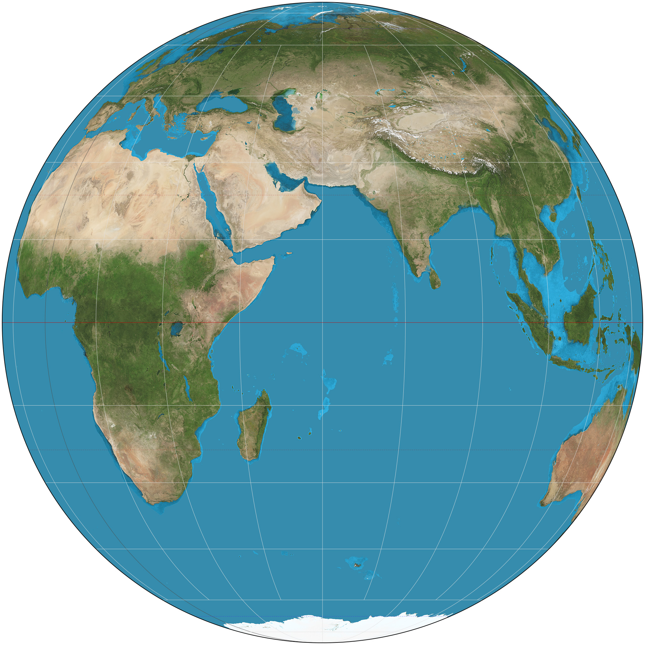
Orthographic
The projection shown in the emoji 🌎🌍🌏
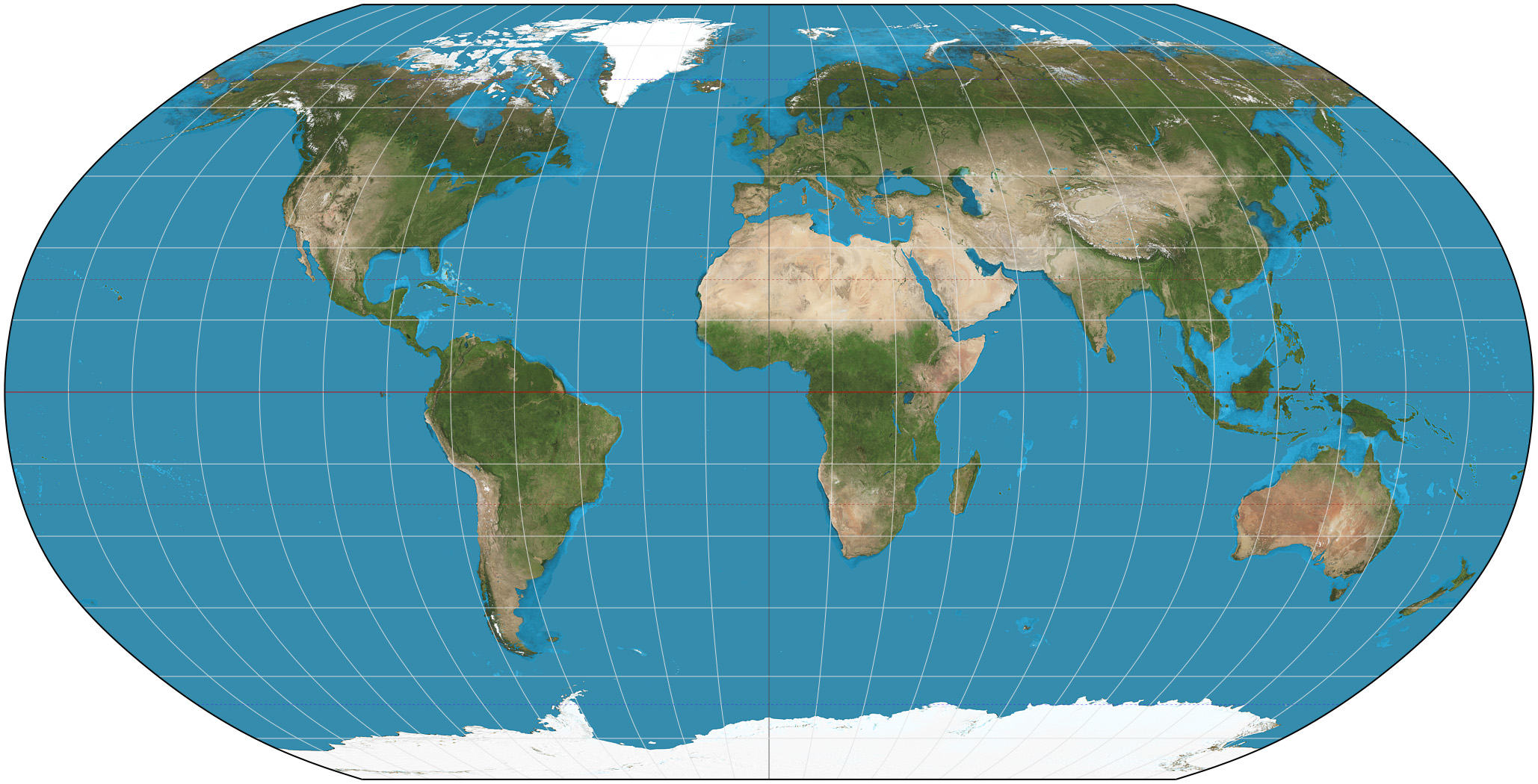
Robinson
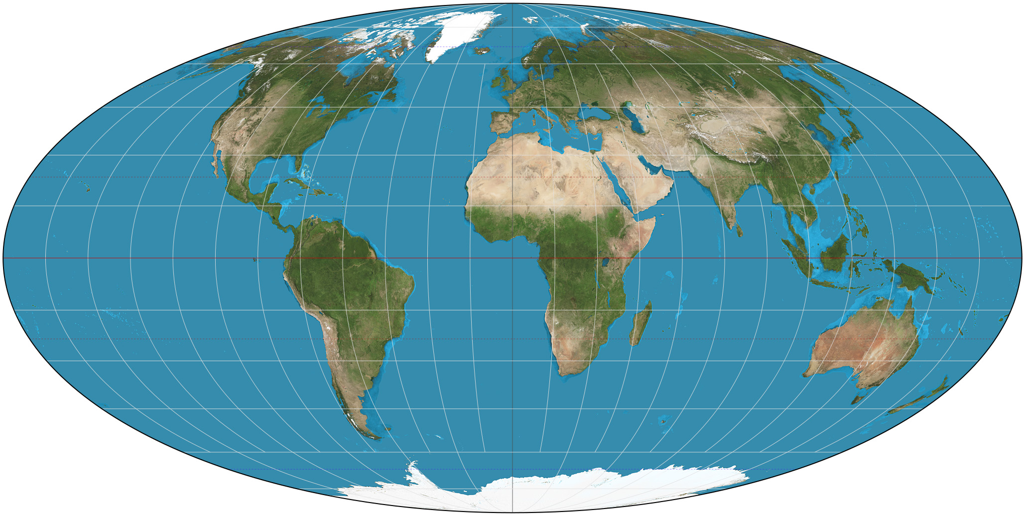
Mollweide
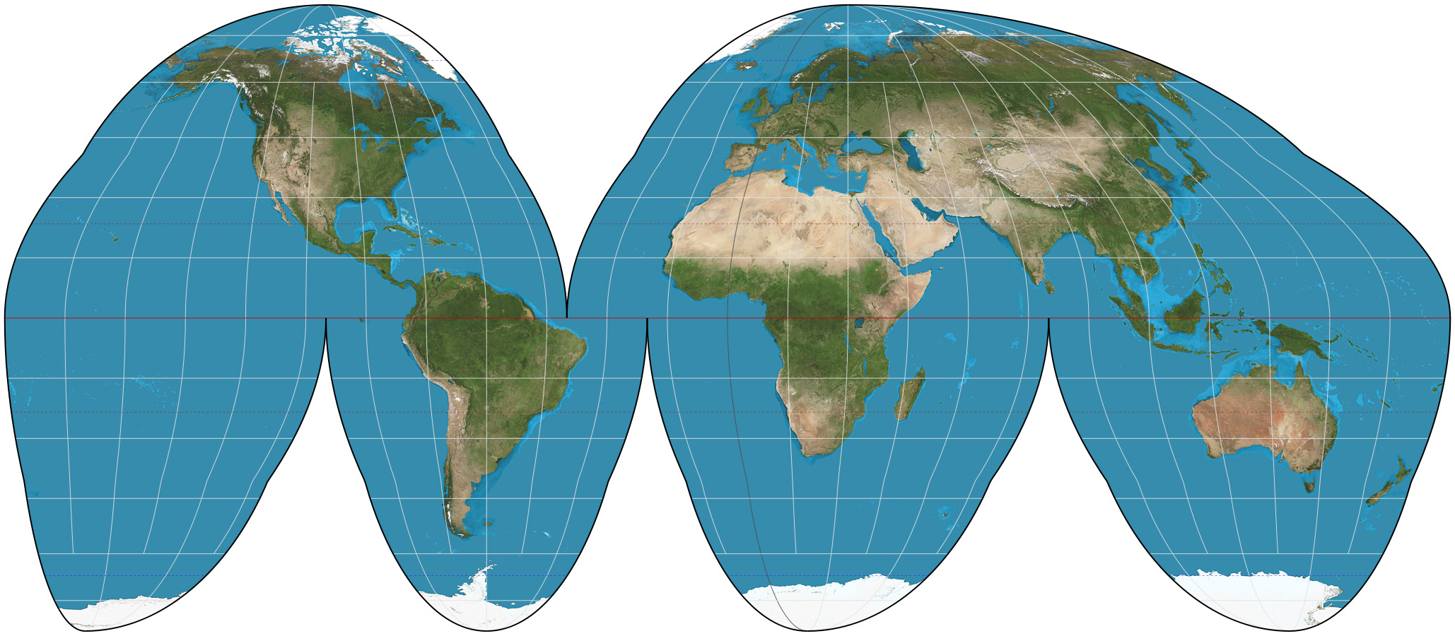
OkayGoode homolsine
Alber's conic
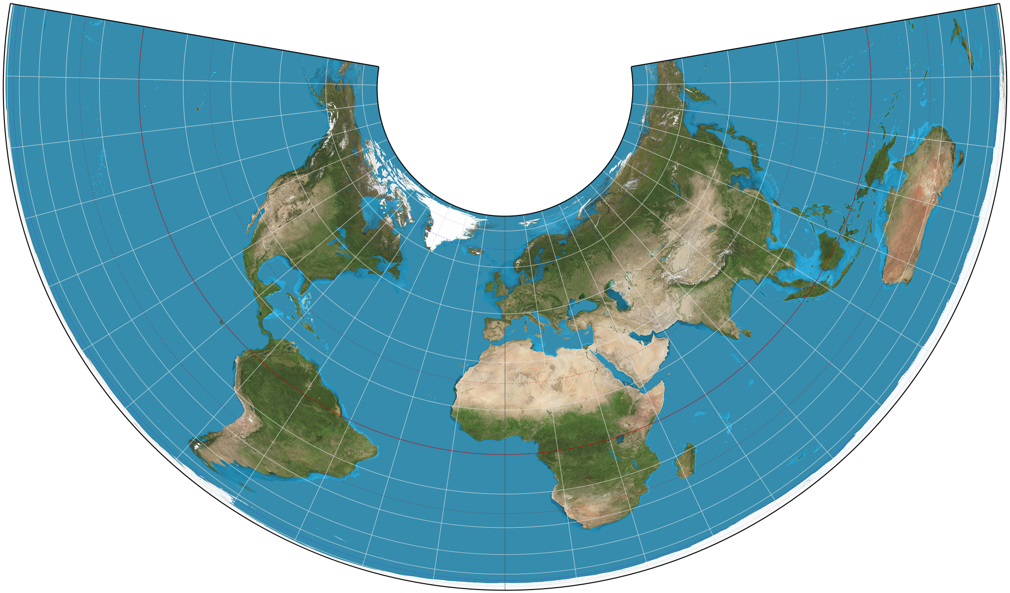
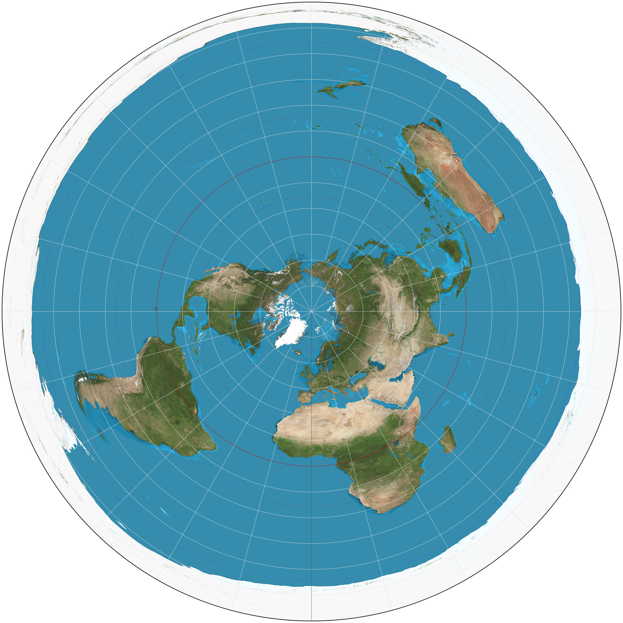
Azimuthal equidistant
This one may remind you of the UN flag, and indeed, that is the projection it uses. This is also the projection that Flat Earthers think truly represents the Earth. Flat Earthers are, of course completely wrong. The Earth is thicc, not flat.
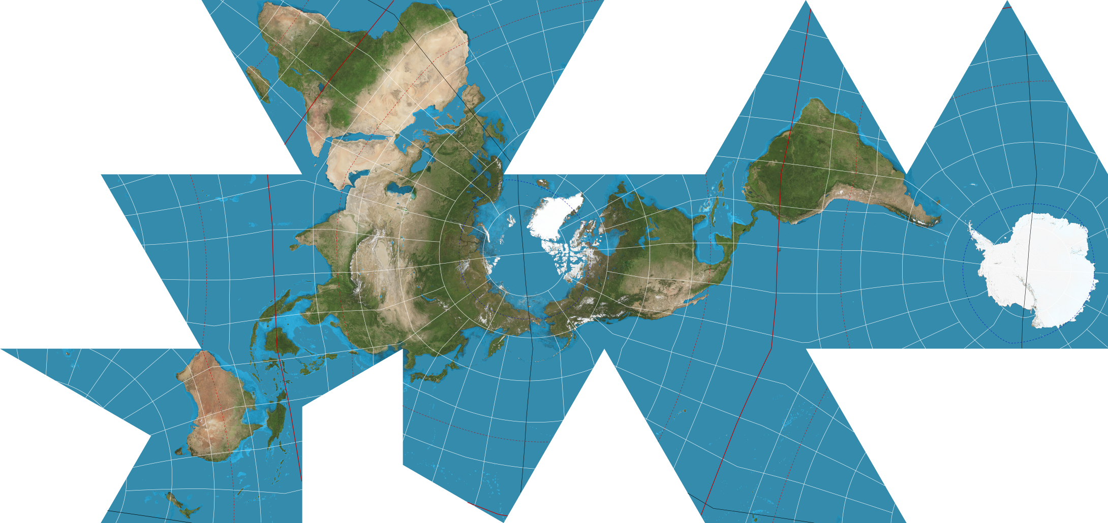
Dymaxion
My personal favourite. Of course I have a favourite map projection, doesn't everyone?
The Mercator projection
This is the crux of the controversy here and what I'm looking to get at.
The Mercator projection looks like this:
(Those dots are Tissot's Indicatrix, a measure of a projection's relative distortion).
You've most definitely seen it. This is the projection Google Maps uses (well, strictly speaking, it uses Web Mercator).
Why do people think it's racist?
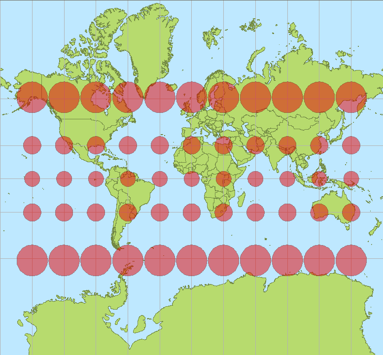
Well, as you can see by the dots, northern latitudes are shown to be far too large, whilst Africa is shown to be relatively small. The reality is Africa is very, very large.
How large?
Here is an image of Africa with Russia, Germany, the UK, Spain, France, and India overlayed.
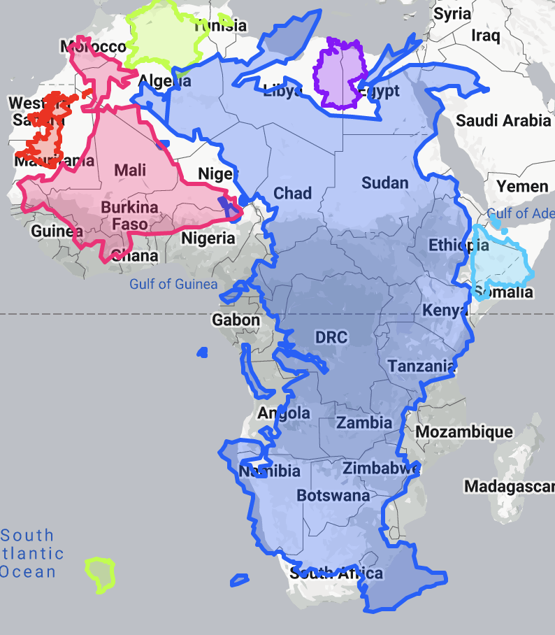
(That green bit in the Atlantic is French Guiana, and yes indeed it is part of France.)
The Mercator projection has lied to you.
Okay, but is there anything to the whole “it's racist” thing?
There is nuance here.
The thing about the Mercator projection is that it has some unique properties: – North is always up, south is always down (or down on an inverted map), this may seem obvious but many projections do not preserve this property – Although sizes are distorted towards the poles, shapes are preserved – Most mid-range latitudes are not exceptionally distorted – Lines of latitude and longitude are perfectly straight
Which is why it's used in global navigation. There really aren't many projections which can do a better job for this purpose. This is why Google Maps uses it.
For local navigation, there may be better choices, but it's not as important on a local level anyway. More on that in a bit.
But for general use, there's no reason to use Mercator, and I do suspect an element of racism and colonialist mindset is there as for its continued use.
Proposed replacements
The reality is, most of us aren't Magellan, and we won't be circumnavigating the globe.
Mercator became the main map projection displayed in classrooms, likely due to its convenient property of “north is always up” and showing shape. But the distortion of European countries and America's size likely played at least a subconscious role in it as well, if I had to guess. This is also why “north is up” as well, when there's actually no reason whatsoever it has to be that way.
Global navigation
Unfortunately, there aren't really good replacements for Mercator for navigation. It's the only projection that preserves size, shape, and north pointing upwards, even with its unfortunate size distortion.
Displaying the Earth for educational purposes
There are better projections for display. This is why Robinson (as shown above) is becoming more common. I argue the Dymaxion projection is also a good projection, if only because it looks cool and has a minimal amount of size and shape distortion (at the cost of distance being difficult to visualise).
Local navigation
For local navigation, it's actually not that important what projection is in use, most of the time. The distortion is just not visible on that scale. It really doesn't make a bit of difference. Personally I like equal-area projections, but again... it doesn't matter on the local level.
Reasoning about relative sizes of countries, continents, and oceans
For this purpose, there is no replacement for an equal-area projection. Even if shape is distorted (although a compromise projection can help with this), preserving size can still give an idea the true size of something.
Weather
Most of the time, orthogonal projections are used for global weather, such as earth.nullschool.net. Though if you tinker with that site, you'll see other projections are available.
Conclusion
Overall, I don't think replacing Mercator in every context is worthwhile. However, I do think exposure to other map projections is needed in schools. There are so many different ways to see the Earth, and each projection offers a unique perspective on the planet. Teaching more projections can help students and by extension society reason about the true nature of our planet.
It may also help students reason about the true scale of colonialism, and help them realise just how much of the planet Western powers took over in their bid for dominance. It's truly sobering to think that a continent as large as Africa came under the dominance of such small countries.
— Elizabeth Ashford (Elizafox) Fedi (elsewhere): @Elizafox@social.treehouse.systems Tip jar: PayPal || CashApp || LiberaPay